This post was sponsored by Simon Says Stamp. Thanks, Simon!
Hi friends! The new Sweet Wishes release from Simon Says Stamp contains a gorgeous new ink trio of luscious, vibrant reds that I used as the inspiration point for my projects today. I always love new ink colors, as color is frequently the first element that I decide when mentally designing my project, and these vibrant, cool reds are absolutely perfect for the holiday season. I used two different techniques with the same embossing folder for today’s projects, so let’s get started with the details!
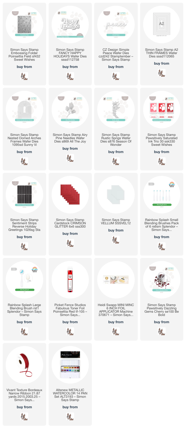
*I have linked all of the products used at the bottom of the post for your convenience using affiliate links. Thank you for shopping with my links! I truly appreciate your support for my work!*

For both of my projects today, I put the new Ink Trio 30 to use with the beautifully intricate new Poinsettia Field Embossing Folder. The 3D embossing folders from Simon Says Stamp are amongst my most favorite products from every release, because there are so many ways to use them, and so many mediums with which to pair them. I’ve used two different techniques for my projects today, creating two completely different looks with almost identical supplies.

For my first project, I ran a panel of white cardstock through my die cutting machine using the new Poinsettia Field Embossing Folder. To add color to the panel, I flipped the embossed image over to reveal the debossed background, with the images impressed into the cardstock rather than popped up. I then used small blending brushes to blend the two lighter inks in the new Ink Trio 30 in the center of each flower, blending the lightest over most of each flower and enhancing the center of each flower with a small amount of the middle shade from the trio. After I had finished blending on each flower (which sounds time consuming, but actually went quite quickly!), I swiped the darkest shade from the Ink Trio 30 over the raised areas, putting the ink pad directly onto the cardstock, which enhances the pattern and creates such unique texture! I blended that same deeper red around the edges, creating a halo, and splattered the entire panel with metallic red watercolor.

After I had finished creating the background, I die cut a frame from some glittery red cardstock using the Nested Domed Arches Frames and adhered it to the card front using liquid adhesive. I used the same glittery red cardstock to die cut the detail layer of the Fancy Happy Holidays die set and added a vellum shadow behind it. To enhance the sentiment, I die cut some foliage using the Airy Pine Needles die and Rustic Sprigs die, tucking the monochromatic die cuts behind the sparkling dimensional sentiment. Finally, I added a few Cherry Pawsitively Dazzling Gems for added sparkle!

For my second card, I did some simple ink blending using the new Ink Trio 30, using blending brushes to blend a smooth ombré horizontally across a white A2 card front. After ink blending, I made sure that the cardstock was completely dry with my heat tool and ran the panel through my die cutting machine with the Poinsettia Field Embossing Folder. The color saturated panel enhances the incredibly detailed background so beautifully, adding texture and pattern to the panel.

After I had finished the background, I die cut another glittering frame, this time using the A2 Thin Frames and the same Crimson glitter cardstock from Simon Says Stamp. I adhered the frame around the edges of the blended, embossed background. The frames help to draw the eye towards the focal point in the center of the card, as well as add texture to the monochromatic card. I die cut the detail layer of the Simple Peace die from some coordinating red cardstock and the shadow layer from more red glitter cardstock, adhering the two layers together with liquid adhesive. I popped the sentiment die cut up with some foam adhesive squares, then tucked a sentiment strip from the Reverse Holiday Greetings sentiment card set, to which I had added some red toner foil using my Minc machine. To accent the sentiment pieces and add a bit more botanical softness to the card, I die cut a deep red Airy Pine Needles sprig and tucked it beneath the sentiment pieces. Finally, I added a Bordeaux ribbon bow and some shimmering gems.
Well, that’s all for my projects today! Each of these cards is so different while still being exactly the same color palette. It’s amazing what a difference technique makes for the color saturation with these embossing folders! Thanks so much for stopping by today, and have a marvelous day!
